UX/UI · Research · Information Architecture
A product story about learning, observing and belonging.
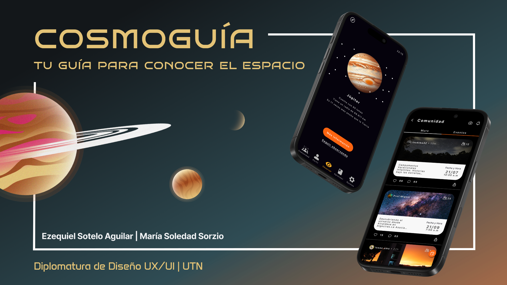
Cosmoguía was born from one question: how could astronomy feel less intimidating for someone who is just getting started?
Team & role
Ezequiel Sotelo Aguilar and I worked end-to-end across research, product definition, information architecture, flows, UI and prototyping. My strongest focus was UX Research; Eze brought his specialization in UX Writing and content. Most design decisions were shaped together.
01 · The starting point
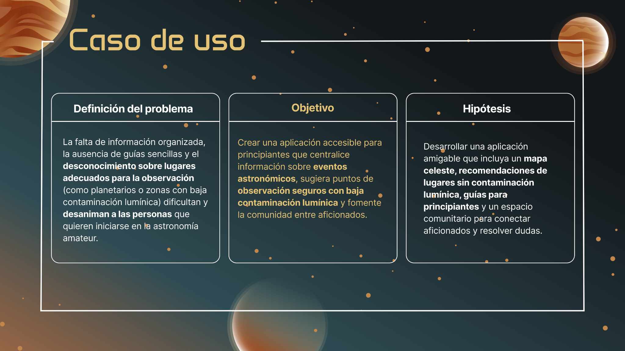
We did not want another astronomy app full of data.
The opportunity was to help beginners understand what to look at, where to go and how to connect with other people interested in the sky.
02 · Research → direction
Before designing, we listened for patterns.
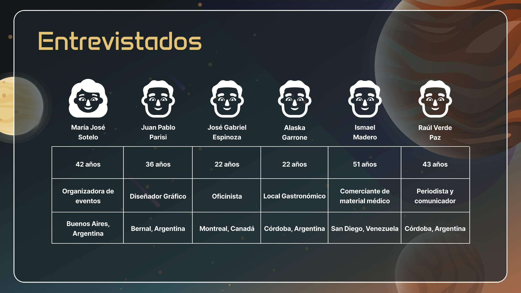
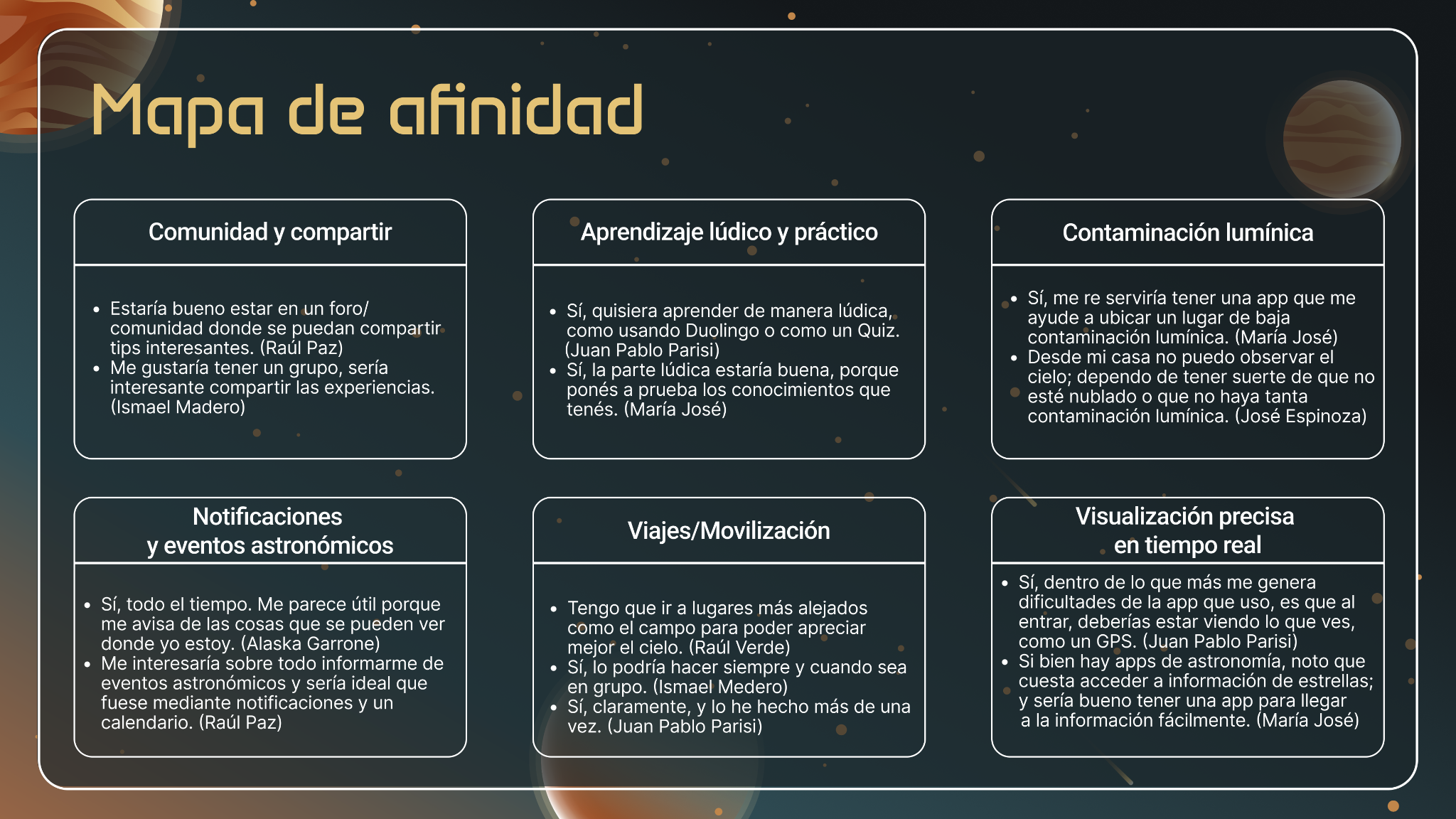
Interviews and synthesis revealed the same themes again and again: simple learning, better orientation, low-light-pollution places, useful event alerts and a sense of community.
6
interviews
5
competitors reviewed
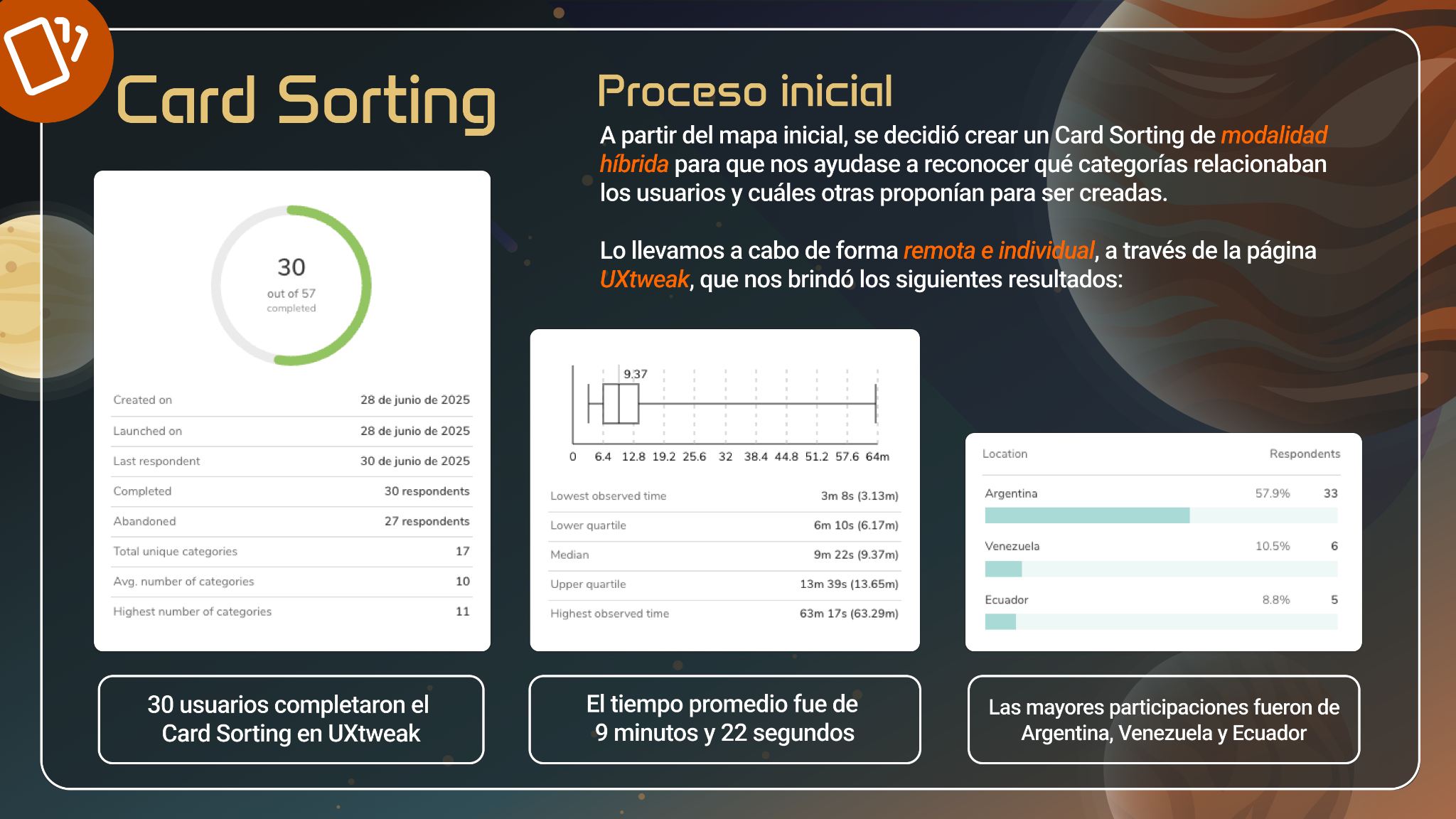
30
card-sorting completions
03 · From insights to architecture
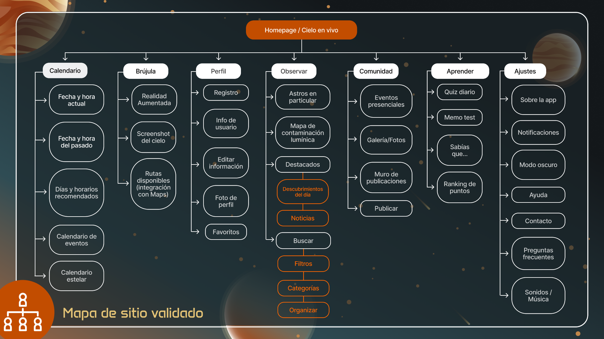
The structure came from the users.
A hybrid card sort helped us simplify a broad initial map and validate how people expected the content to be grouped. That became the backbone of the MVP.
04 · From structure to experience
Once the path was clear, we could design the interaction.
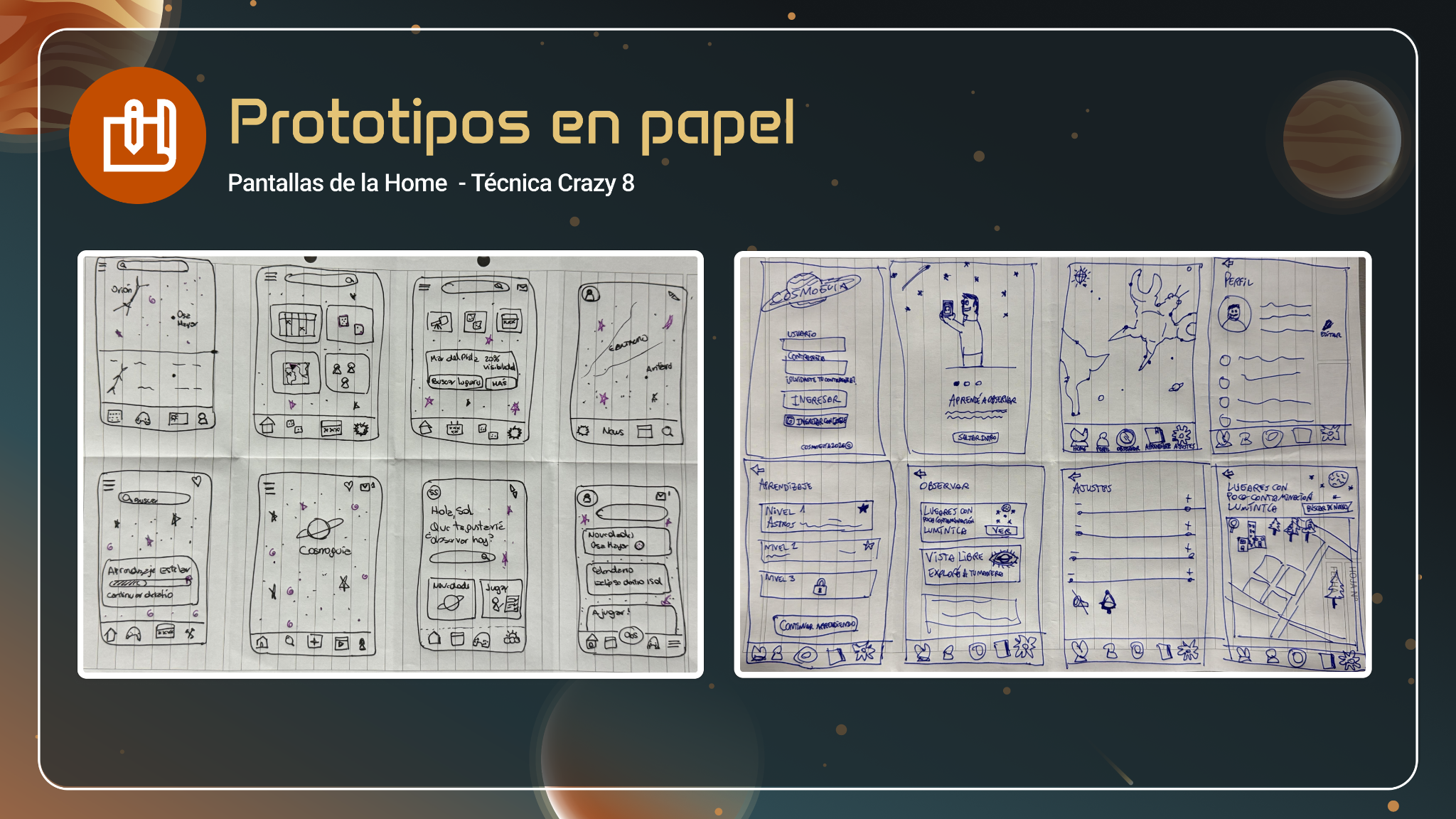
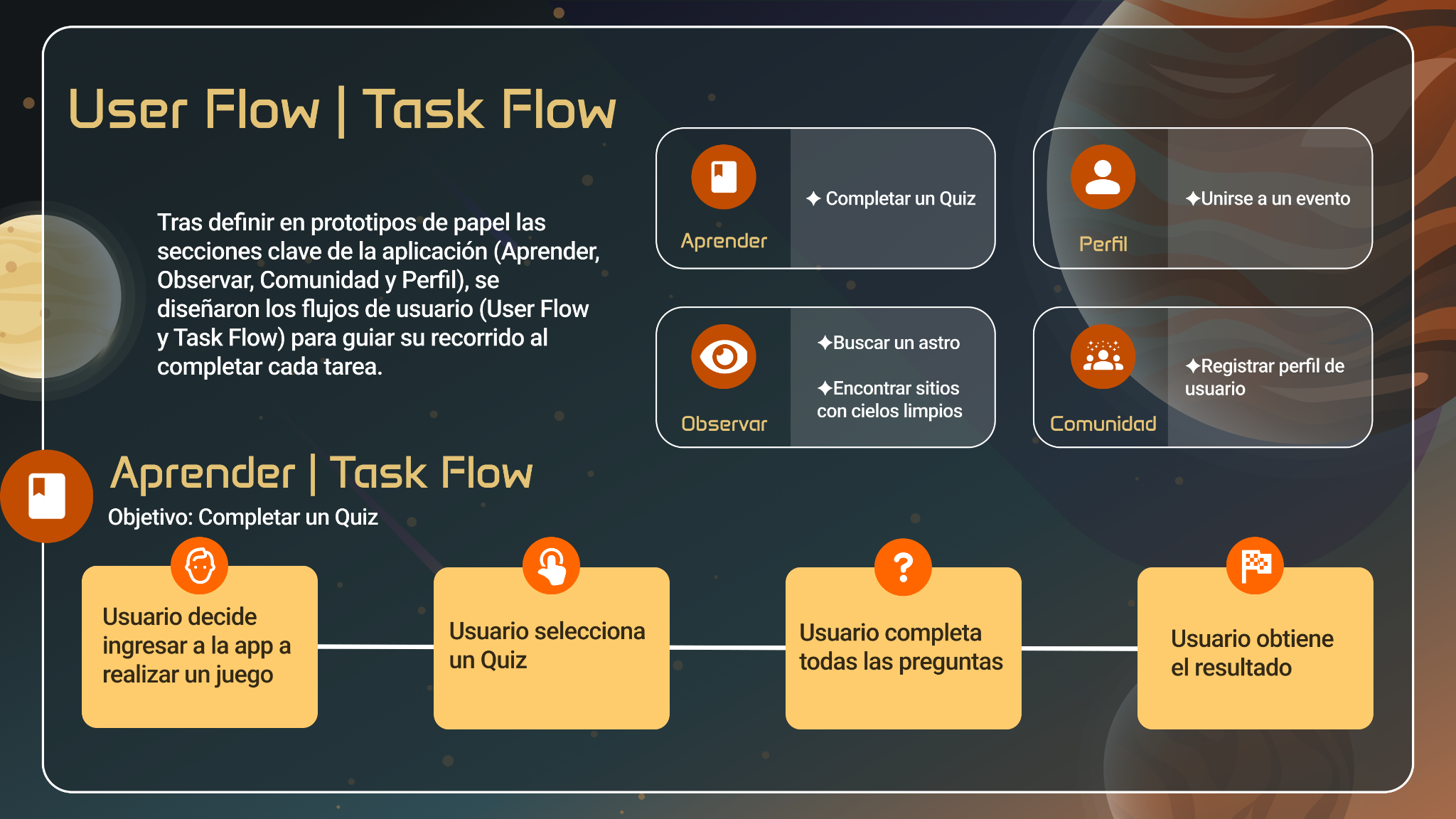
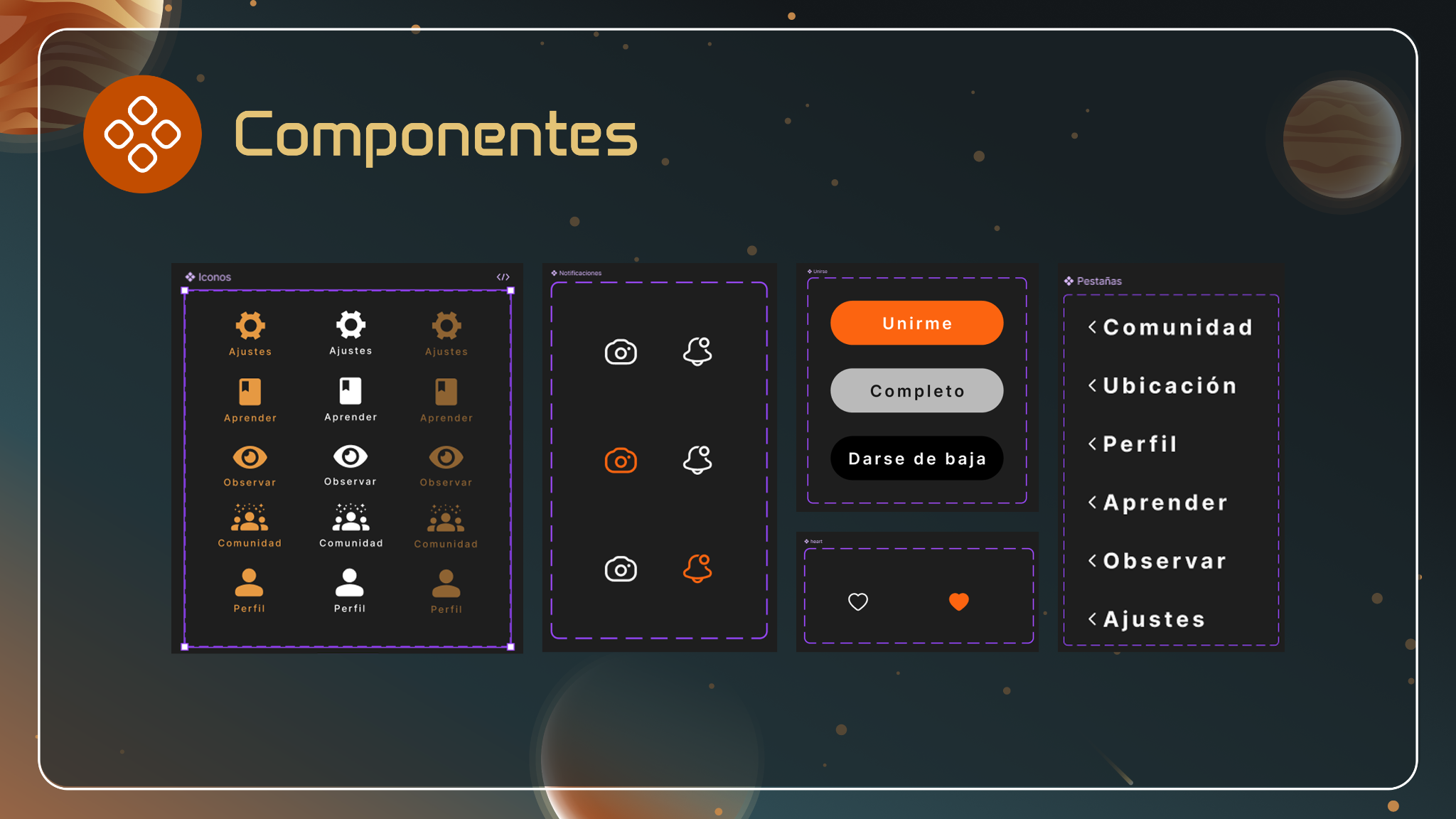
We moved from paper and flows into a reusable visual system, keeping the product centered on three ideas: Observe, Learn and Community.
05 · Interactive prototype
The story becomes easier to understand when you can use it.
Explore the high-fidelity flow directly here, without leaving the portfolio.
06 · Evaluation & next steps
We finished with a direction to test – not with a claim that the product was done.
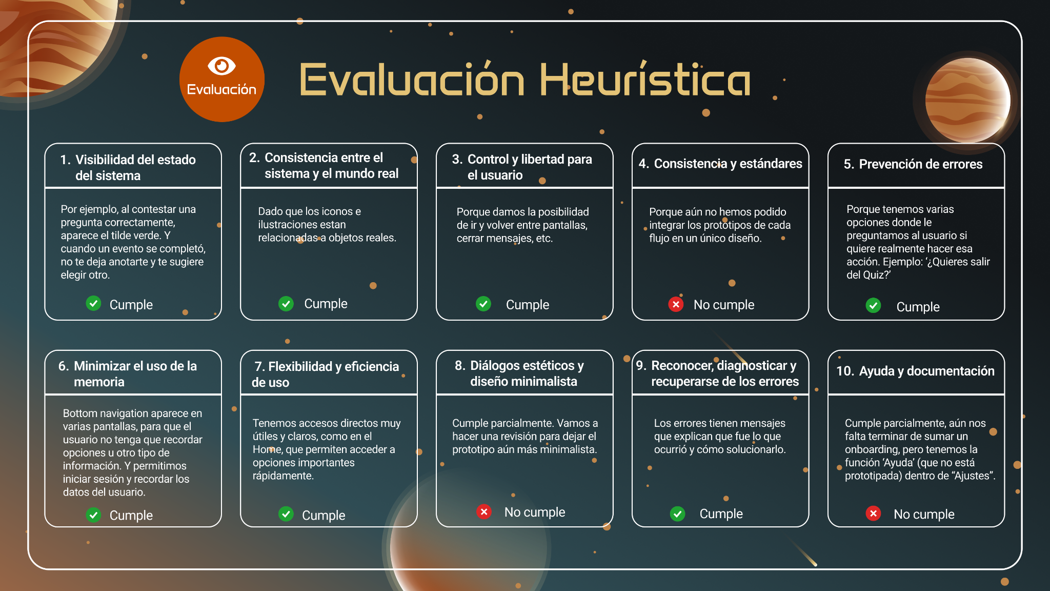
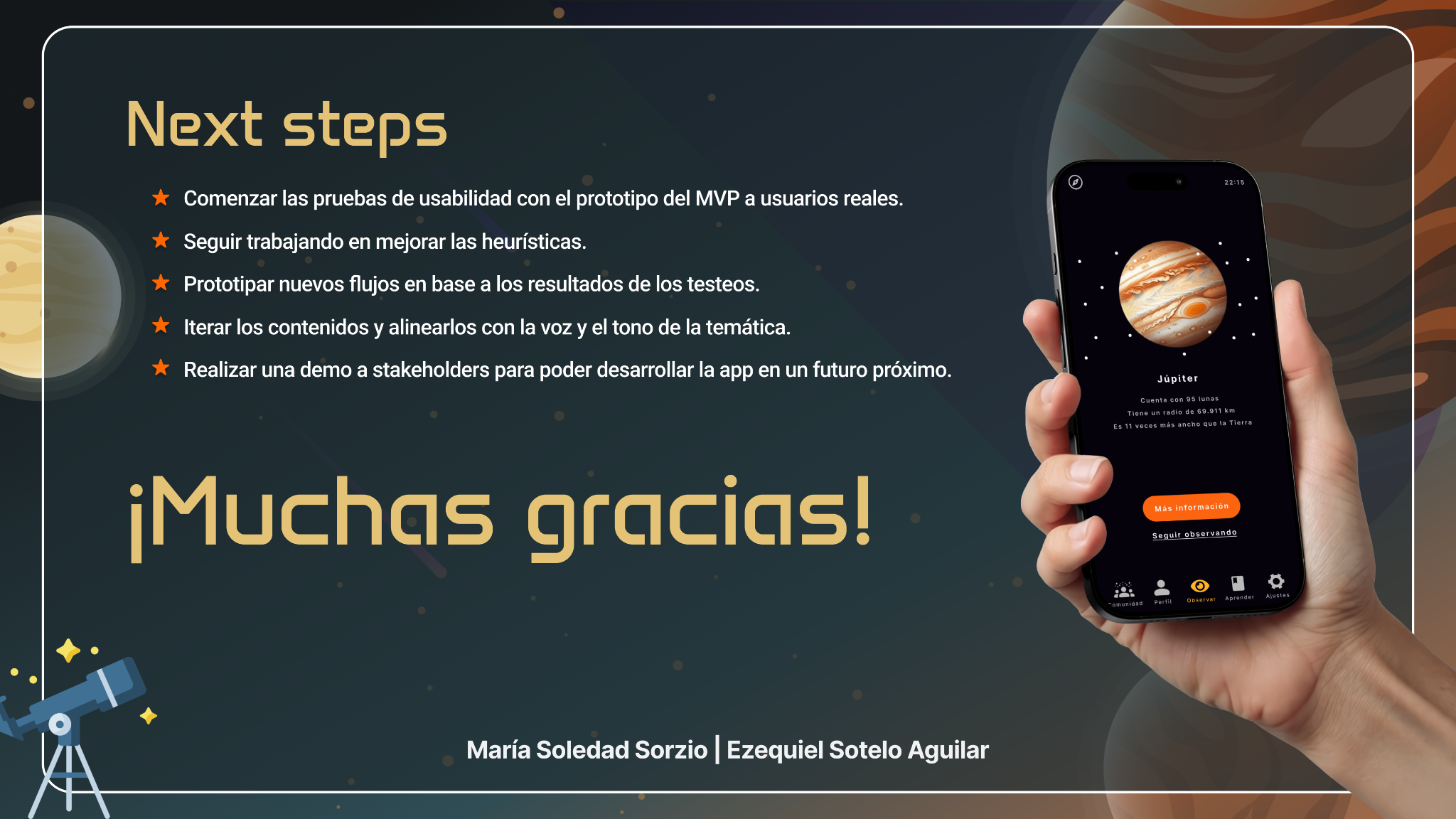
The heuristic review gave us a clear iteration backlog. The logical next step is usability testing with real users, followed by refinements to flows, content and interaction patterns.