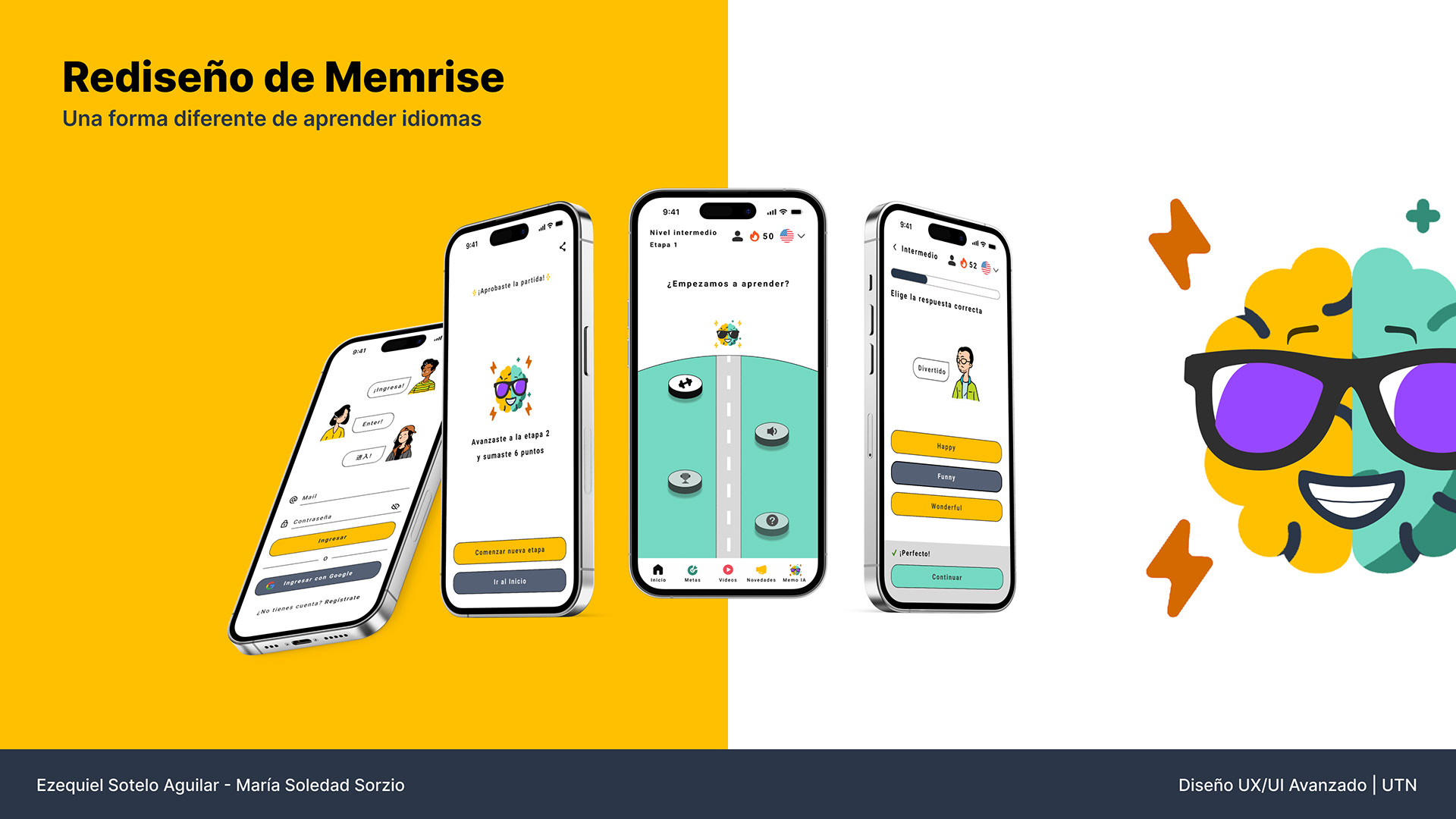
UX Research · Product Design · UX/UI
Memrise – making the learning path easier to understand and easier to return to.
A collaborative redesign developed in Advanced UX/UI Design at UTN, focused on clarity, motivation and continuity in language learning.
Team & role
Ezequiel Sotelo Aguilar and I worked end-to-end across research, product definition, information architecture, flows, UI and prototyping. My strongest focus was UX Research; Eze brought his specialization in UX Writing and content. Most design decisions were shaped together.
01 · The challenge
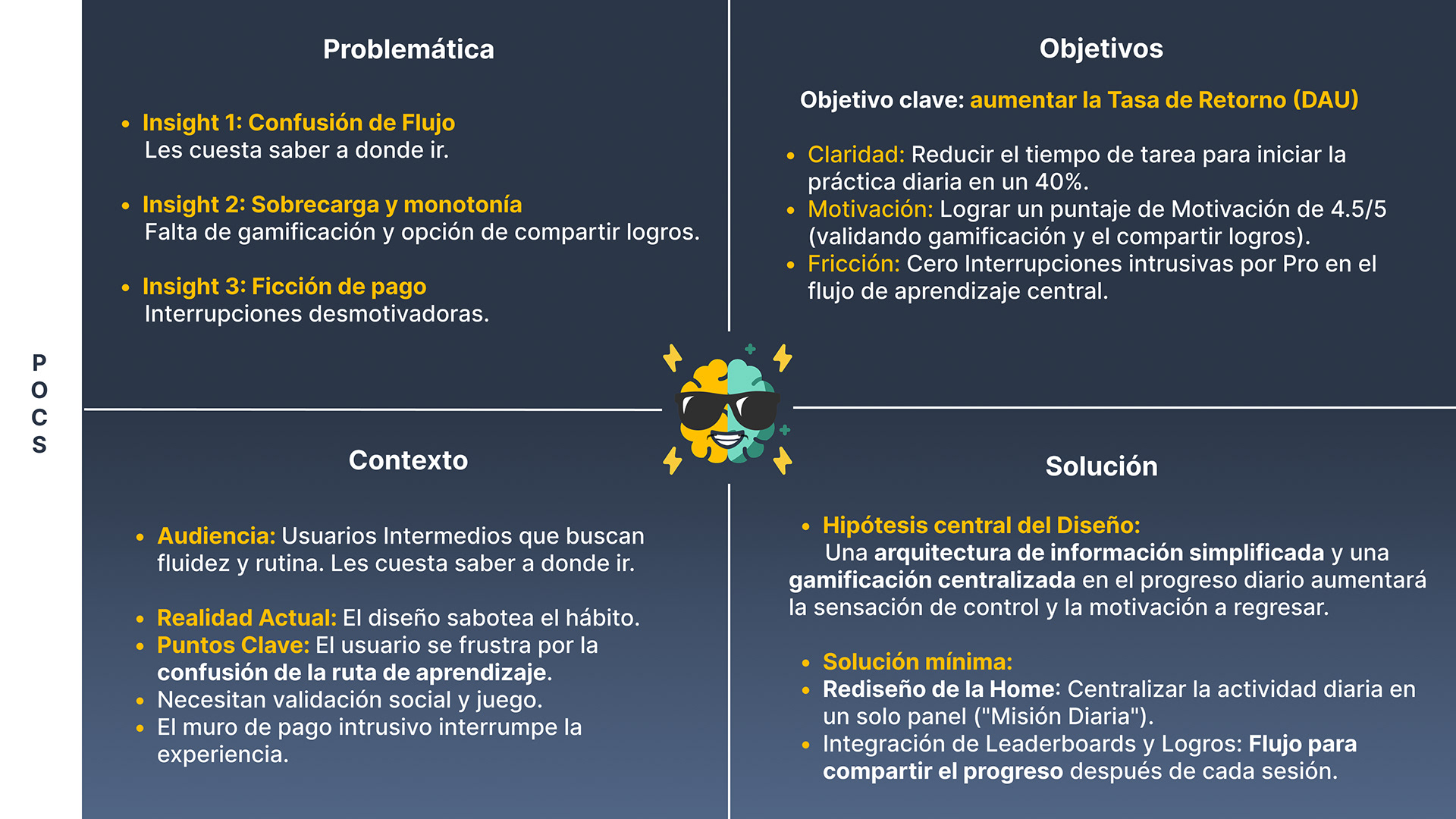
The problem was not a lack of content. It was a lack of clarity.
Research pointed to three recurring frictions: users did not always know where to go next, motivation was not reinforced enough, and premium interruptions could break the core learning flow.
02 · Research → learner journey
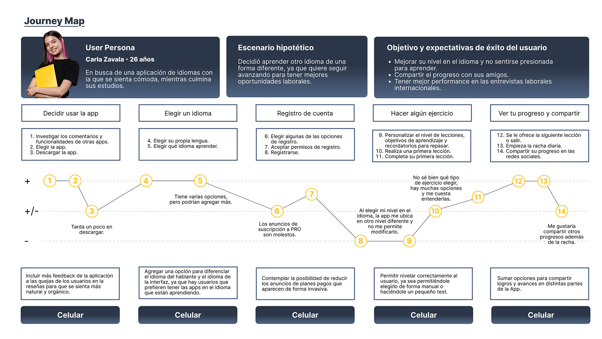
We needed to understand why people return – and why they stop.
Benchmarking, exploratory research, personas and journey mapping helped us connect learning goals with the moments where the experience lost momentum.
67.7%
of respondents were women
74.2%
had not used Memrise
4.6 / 5
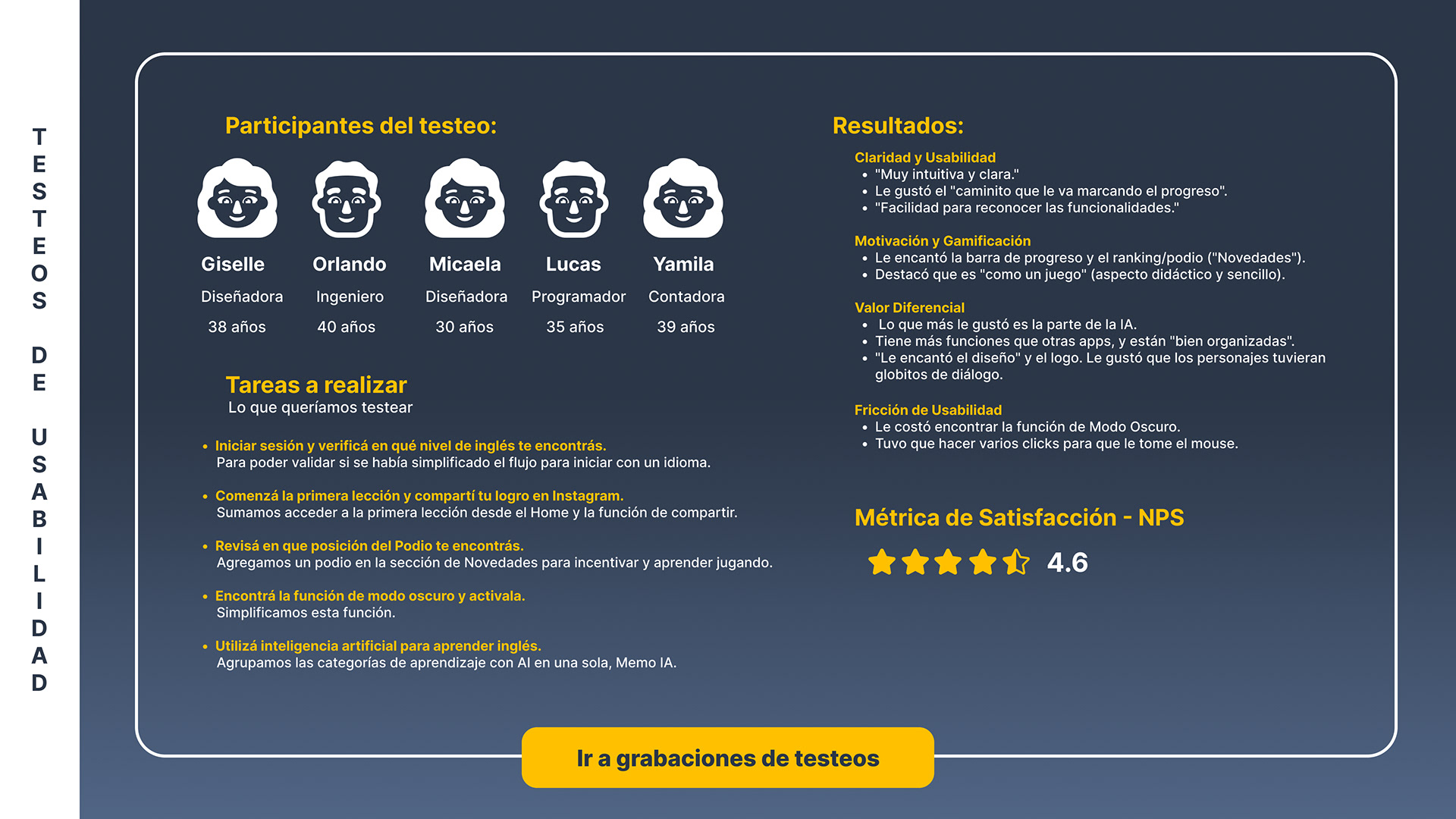
final usability satisfaction
03 · From insight to structure
We simplified the path before polishing the interface.
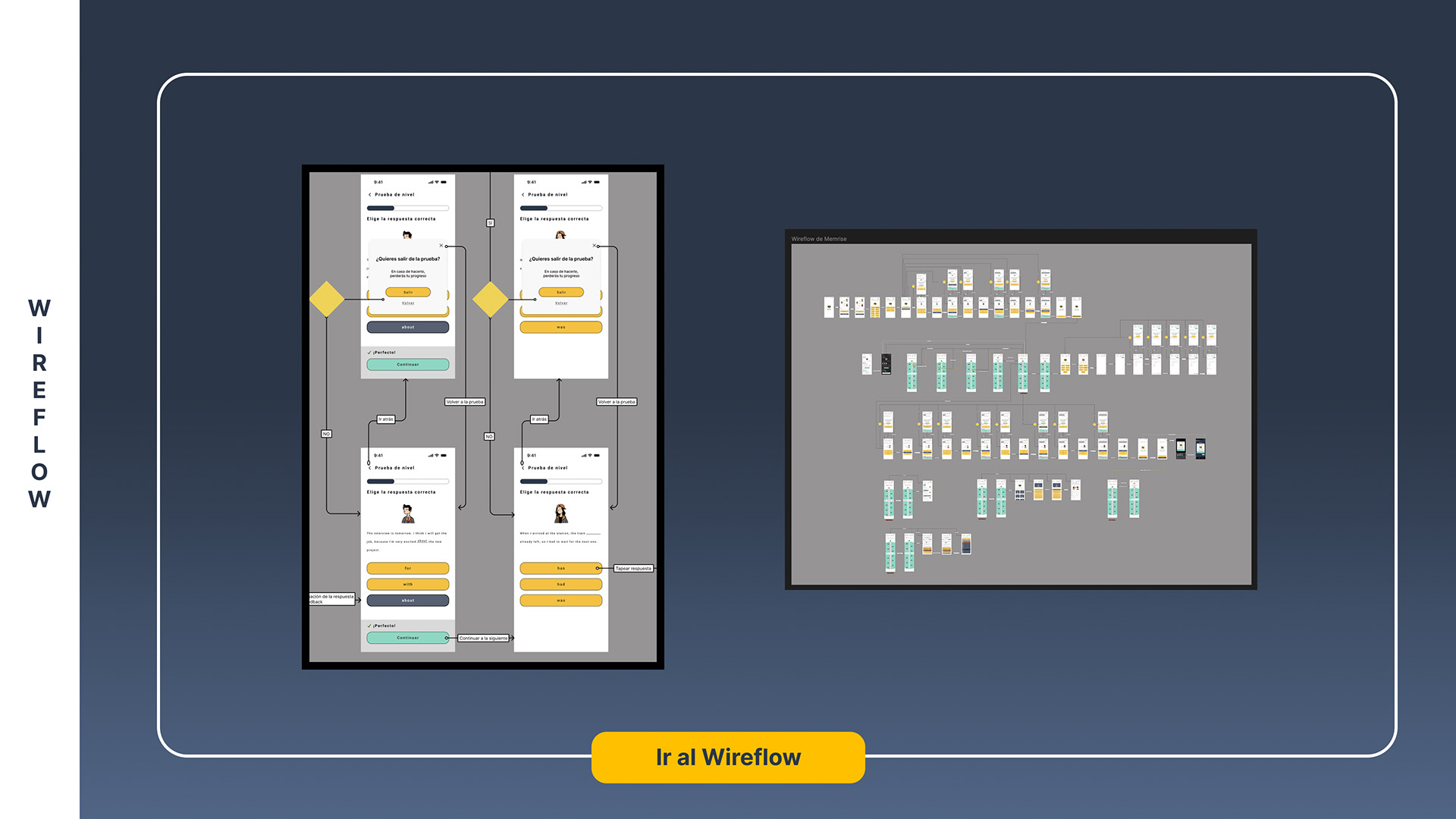
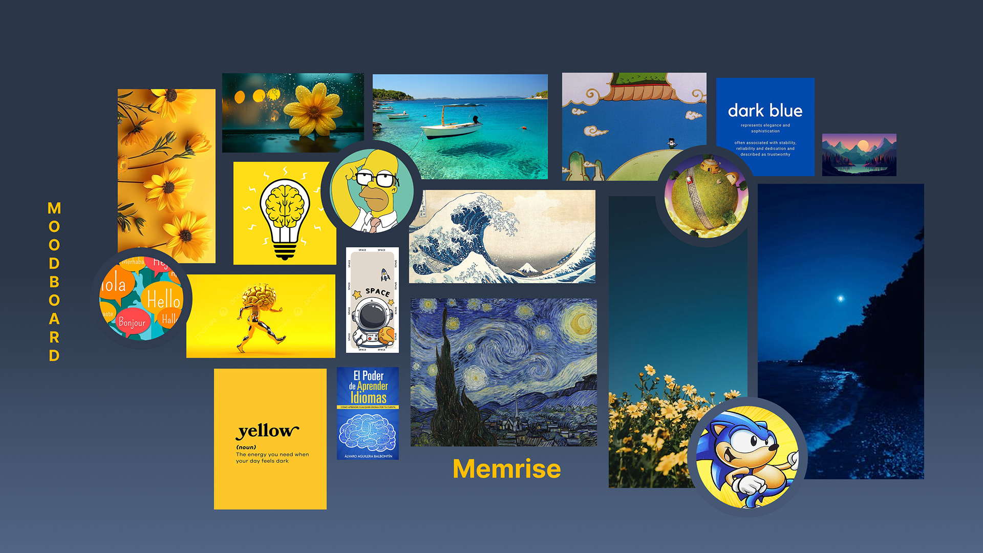
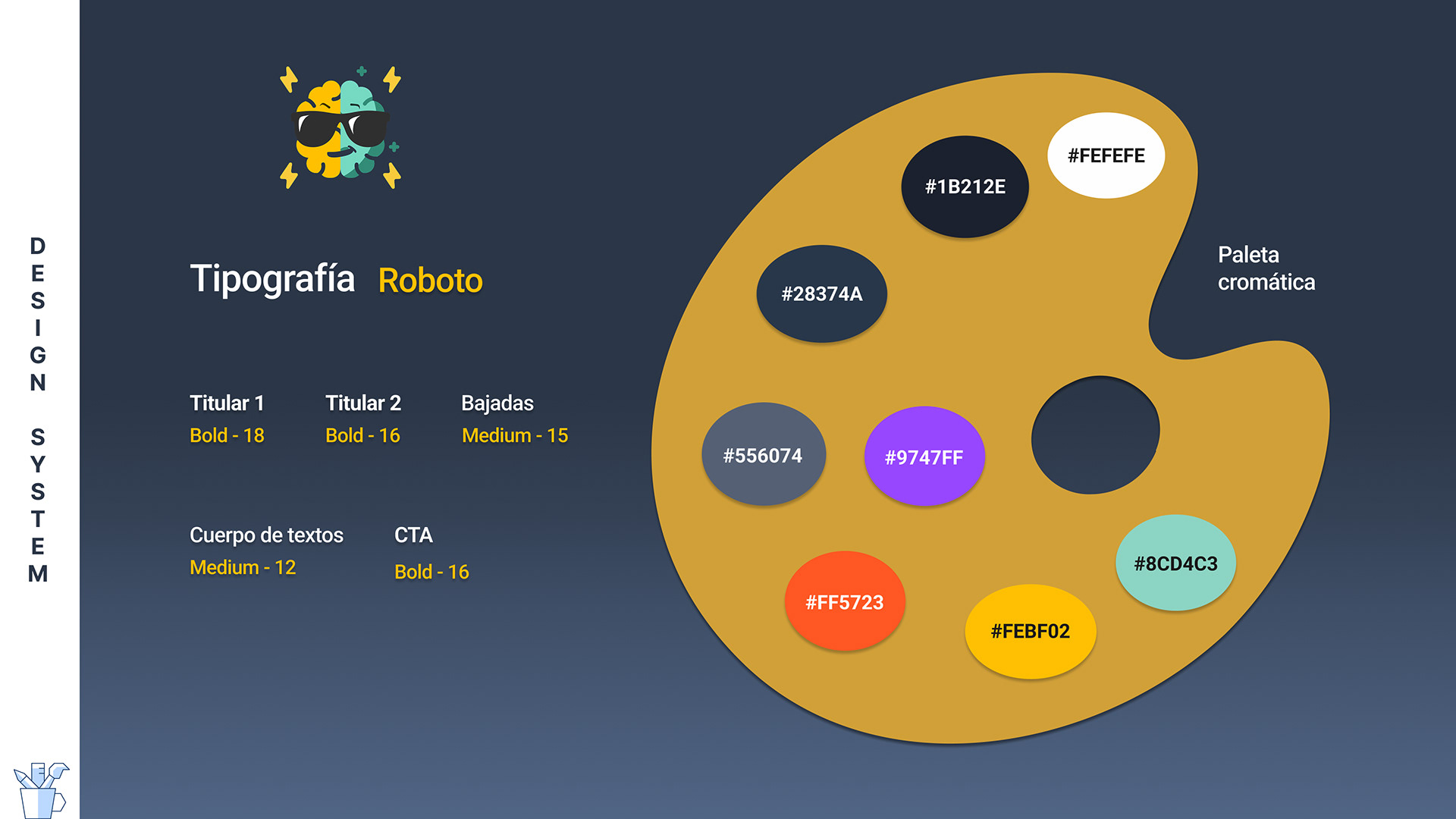
The redesign moved from interaction flows to a clearer visual system. Progress, rewards and AI practice were organized around a more understandable daily learning experience.
04 · Final experience
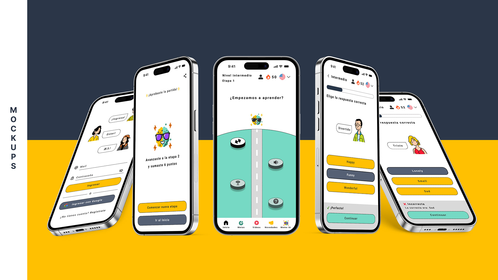
The final UI makes progress visible without making the product feel childish.
The result combines clearer navigation, gamified progress, social sharing and a more coherent Memo IA experience.
05 · Usability testing
We tested whether the direction actually felt clearer.
Five participants completed five core tasks. Feedback validated the overall clarity, progress cues and AI value, while also revealing discoverability details to refine.
5
participants
5
core tasks
4.6 / 5
satisfaction